Documentation / Advanced Concepts
CSS reference
Styling
You can configure a lot of the appearance of a graph using a style sheet that mimics the way CSS works for HTML.
You can select the renderer (gs-ui-swing, gs-ui-javafx or gs-ui-android) by importing the library and using a system property.
The fully-CSS compliant renderer in Swing can be set this way for example:
public static void main(String args[]) {
  System.setProperty("org.graphstream.ui", "swing");
  ...
}
You only need to set this property before calling Graph.display() (except for gs-ui-android that doesn’t have display()).
However you can set the renderer by creating the viewer for example.
More details are provided here.
Specifying the style sheet
You specify the style sheet of a graph by putting a ui.stylesheet attribute on the graph. This attribute takes as value either a string containing the style sheet or the URL of a file on the local machine, or on any web site.
For example to pass a simple style sheet under the form of a string you can use:
graph.setAttribute("ui.stylesheet", "graph { fill-color: red; }");
Which will color the background of the graph in red. Alternatively you can link to a file or URL:
graph.setAttribute("ui.stylesheet", "url('file:///somewhere/on/my/disk/stylehsheet')");
Or:
graph.setAttribute("ui.stylehseet", "url('http://somewere/in/the/clouds/stylesheet')");
How style sheets mix
Each time you change the ui.stylesheet attribute, the new style are merged with the old ones. This means that style sheets are cumulative.
You can however remove any style sheet using:
graph.removeAttribute("ui.stylesheet");
You can also add style for an individual element using the ui.style attribute on the element
node.setAttribute("ui.style", "fill-color: rgb(0,100,255);");
The syntax is explained under. This creates a style for this specific node. However if you remove the attribute, this will not remove the style for the node.
The style sheet syntax
The syntax used by GraphStream is very similar to the one used by CSS.
Style rules
Each style sheet is a sequence of style rules. A style rule is made of a selector and a set of style properties. Each rule defines the style of a group of elements of the graph. It can apply to a particular element, or match a group of elements, therefore applying the same style to the entire group.
Style selectors
Selectors define to which group of elements the style properties will be applied. There are four basic selectors:
graphwill apply the style to the graph background.nodewill apply the style to all the nodes of the graph.edgewill apply the style to each edge.spritewill apply the style to each sprite.
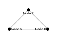
You can further specify to apply the style to individual elements. To identify elements by their identifier you can use the # character followed by the identifier of the element. For example to define the style of a node with identifier A, you could use node#A.
You can also assign classes to elements. To assign a class to an element you change its ui.class attribute. For eexample:
graph.getNode("A").setAttribute("ui.class", "foo");
Elements can pertain to several classes at once:
graph.getNode("A").setAttribute("ui.class", "foo, bar");
You specify a selector for a class using a dot . and the name of the class. For example to define a class of edges you can use edge.strange. Edges having the strange keyword in their ui.class attribute will have this style. If an element pertains to several classes, the styles of each class will be merged, if there is a conflict the style appearing in the first class in the class list is chosen.
Events
The GraphStream CSS allows to specify styles for elements that are applied only when a given condition is met. Events are added to selectors using the : (colon) symbol. Actually the two events clicked and selected are known. The first one occurs when an element is clicked, or when it is selected. Note that the default viewer only generates these events for nodes and sprites by default. To mark an element as clicked, it must have the attribute ui.clicked. This is done automatically by the viewer (for nodes and sprites). To mark an element as selected it must have the attribute ui.selected. Once again this is automatically done by the viewer (for nodes and spites), however you can put theses two attributes by yourself on elements of the graph if you whish (Note that these attributes will appear in your graph only if it is sink of the viewer).
Event styles adds to the style of the element.
Therefore, to define the style of elements when a specific event occurs, you can write selectors like node:clicked or sprite::selected.
Style properties
The selector is followed by a set of style properties between curly braces. A style property is made of a name, a colon (:), a set of values separated by comas, and finally a semi-colon. Here is a complete style sheet:
graph {
	fill-color: red;
}

node {
	size: 10px, 15px;
	shape: box;
	fill-color: green;
	stroke-mode: plain;
	stroke-color: yellow;
}

node#A {
	fill-color: blue;
}

node:clicked {
	fill-color: red;
}
This style sheet contains three selectors, one to define the style of the graph background, another to define the style of every node, and finally one to define the style of the (necessarily unique) node with identifier A.
Note that some selectors style inherit other styles. Each selector qualified by an identifier or a class inherit the style of the main selector. For example, here, the style of the node A will be merged to the style applied to all the nodes. Only the fill color will be changed. Indentically, when any node is clicked, the fill color will become red, but only the fill color is changed.
Each style property can have one or more values. For example the size property here takes two values, a width and a height for the box shape. These values are separated by comas.
Values and Units
Values are either fixed keywords or numbers. Numbers must have a unit. The default unit are graph units. These are the units you use to position nodes and sprites for example, they are handled by you. But you can also use pixel units. This can be useful to have, like in the above example, a box that is always the same size on screen, independently of the size of the graph displayed. Accordingly, you can use the % sign to have values proportional to another. Often the percents indicate the size proportional to the container of the element, most of the time, the size of the graph (diagonal of its bounding box).
Some properties expect colors as values. The CSS knows almost all of the named colors of HTML, therefore values likes red, green, blue, cyan, magenta, yellow, aquamarine… are accepted. But you can also specify colors using two other notations. The HTML notation uses a dash sign # and hexadecimal numbers by pairs of three (RGB) or four (RGBA), or six (RGB) or height (RGBA), or twelve (RGB) or sixteen (RGBA). You can also specify colors the CSS way using the rgb(R,G,B) or rgba(R,G,B,A) notation, where R, G, B or A are integer values between 0 and 255. The alpha value is the transparency, 0 meaning fully transparent and 255 meaning fully opaque. Here are several examples:
node#A { fill-color: red; }             /* The node A will be red.       */
node#B { fill-color: #F00; }            /* The node B will also be red.  */
node#C { fill-color: #FF0000; }         /* The node C will still be red. */
node#D { fill-color: #FFFF00000000; }   /* We all love red.              */
node#E { fill-color: rgb(255,0,0); }    /* Red, red, red.                */
And with transparency:
node#F { fill-color: rgba(255,0,0,128); }   /* Half-transparent red.       */
node#G { fill-color: #F008; }               /* Still half-transparent red. */
node#H { fill-color: #FF000088; }           /* Did you guessed ?           */
node#I { fill-color: #FFFF000000008888; }   /* That's it.                  */
The CSS reference
Style properties are numerous. Some do apply only to a restricted set of elements.
General properties
-
fill-mode: The fill mode indicates how to color the interior of elements. If applied to the graph, it tells how to fill the whole background.-
none: No fill at all. -
plain(default): Fill with the first color of thefill-colorproperty.
-
dyn-plain: The color is chosen as by interpolation inside the set of colors defined by thefill-colorproperty. This last property must at least contain two colors. Thedyn-plainproperty requires an attributeui.colorto be stored on the element. This attribute must contain a real number larger or equal to 0 and smaller or equal to 1. This value indicates a position in the interpolation of colors. For example, if thefill-colorproperty contains two colors, red and green, in this order, a value of 0 inui.colorwill make the element red, a value of 1 will make the element green and a value of 0.5 will make the element a mix of the two colors. You can put any number of colors in thefill-colorproperty, the interpolation will work along the whole palette of colors. -
gradient-radial: This property requires two colors in thefill-colorproperty. The gradient will be concentric with the first color at the center, and the second color along the border of the element to fill.
-
gradient-horizontal: This property requires two colors in thefill-colorproperty. The gradient will start at the left with the first color, and end at the right of the element to fill with the second color.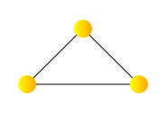
-
gradient-vertical: Likegradient-horizontalbut vertically, from bottom (first color) to top (second color).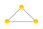
-
gradient-diagonal1: Likegradient-horizontalbut in diagonal from the lower-left corner to the upper-right corner.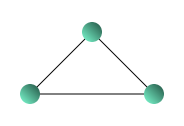
-
gradient-diagonal2: Likegradient-horizontalbut in diagonal from the upper-left corner to the lower-right corner.
-
image-tiled: This will fill the element with an image specified by thefill-imageproperty. The image will keep its size in pixels. It will be centered inside the element. If the image is smaller than the element, it will be repeated to fill the whole surface.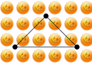
-
image-scaled: The image specified byfill-imagewill be scaled to fill the size of the element, not considering its aspect ratio.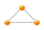
-
image-scaled-ratio-max: The image specified byfill-imagewill be scaled to fill the element, but the image will keep its aspect ratio. If the image has another aspect ratio than the element, a part of the image will be cut at the borders of the element.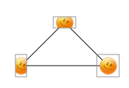
-
image-scaled-ratio-min: the image specified byfill-imagewill be scaled to fill the element, but the image will keep its aspect ratio. If the image has another aspect ratio than the element, a part of the element will be filled by tilling the image.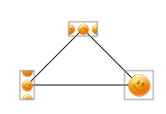
(Image Scaled Ratio Min 1) (Image Scaled Ratio Min 2)
You are not restricted to two colors with gradients if the version of your JVM is larger or equal to 1.6.
-
-
fill-color: The fill color indicate one or more color used to fill to surface of the element. The way colors are used depends on thefill-mode. You specify several colors in order to use gradients of dynamic fill. By default the fill color is black for nodes, edges and sprites, and white for the graph background. -
fill-image: The fill image indicates the image to use when the fill mode requires a texture. The image must be given using theurl()notation. For example to load an image from the local file-system, you write:node { fill-mode: image-scaled; fill-image: url('/somewhere/on/the/disk.png'); }or you can load the image from the Internet::
node { fill-mode: image-scaled; fill-image: url('http://my/favorite/site/image.png'); }By default, there is no fill image.
-
stroke-mode: Control the if the outline of the element shape is drawn or not.none(default): No outline will be drawn.-
plain: The shape outline will be drawn according to thestroke-colorand thestroke-widthproperties.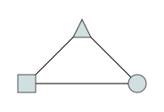
-
dots: The outline is made of dots whose size correspond to thestroke-width. Be careful, for edges the stroke size is added to the size of the edge. So if the edge is 1px and the stroke 1px, the dots will be 2px. To have only a dotted line for example, you can set thefill-modetononethesizeto0pxand the dots will exactly have the size given bystroke-width. dashes: Exactly likedotsbut with dashes of 3 pixels. It is not possible actually to change the size of the dashes.
-
stroke-color: The color of the stroke of an element, thestroke-modemust not benone. Only one color is used. The default color is black. -
stroke-width: The width of the stroke of an element, thestroke-modemust not benone. The default value is 1. -
padding: The padding is the distance between the element stroke and its contents. This must contain one, two or three values, indicating the padding along the X, Y and Z axis respectively. Note: actually thetext-boxshape for nodes and sprite is not yet implemented.Padding can also be very useful for graphs. Applied to a graph, it indicates a distance between the whole graph rendering and the canvas it is drawn into. Indeed, the overall size of a graph is measured according to the position of nodes or sprites, not their size (this would be difficult, since it is possible to fix the node size according to the graph size!). Furthermore, some edges can be curved, and this is not accounted in the graph size computation. To avoid elements to be drawn inadvertently out of the canvas, you can define a padding:
For all elements by default the padding is 0, excepted for graphs where if equals to 30 pixels.
Properties common to nodes, edges and sprites
-
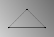
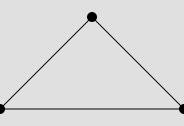
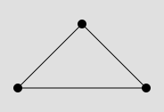
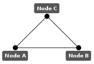
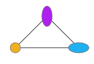
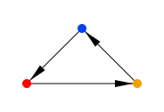
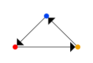
z-index: An integer number indicating the “layer” inside which elements are rendered. This is a rendering order, elements with a lower z-index will be drawn first, whereas elements with a higher z-index will be drawn later. This allows to specify which element appears above another in two dimensions when elements are drawn one on another. You can for example use this to make the edges appear above nodes, or to make sprites appear under nodes. By default edges are drawn at index 1, then nodes at index 2, then sprites at index 3.Under are two graphs, in the first, the nodes are drawn with z-index at 1 and edges at 0, in the second graph, the nodes are at z-index 0 and edges 1.
-
shadow-mode: Shadows draw the same shape as the element they pertain to, but with a size that may be larger (seeshadow-width), and with an offset in the position (seeshadow-offset).none(default): No shadow will be drawn.-
plain: A shadow will be painted with the first color specified byshadow-color.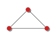
-
gradient-radial: A shadow will be painted with a radial gradient with the two or more colors specified byshadow-color, the first color being at the center, and the last color being on the border of the element shadow.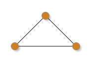
-
gradient-horizontal: A shadow will be painted with a gradient, the first color ofshadow-colorbeing on the left and the last on the right.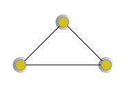
-
gradient-vertical: A shadow will be painted with a gradient, the first color ofshadow-colorbeing on the bottom and the last on the top.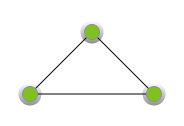
-
shadow-color: Color or colors of the shadow. If the shadow mode is a gradient, two colors at least are needed. The default is black. -
shadow-width: Width of the shadow. This is given in pixels, graph units or percents added to the size of the element. This means that a shadow width of 0 will created a shadow of exactly the same size as the element. The default is 3 pixels. -
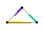
shadow-offset: On or two numbers specifying the offset of the shadow with respect to the element position. If there is one number only, the offset along the X and Y axis are the same. The default is 3 pixels.With a shadow offset at zero, and a shadow width greater than zero you can use shadows as as second stroke around the elements:
-
text-mode: The text mode indicates how the optional label of elements should be printed:normal(default): The label is printed.hidden: The label is not printed.truncated(not yet implemented!!): If the text is too long (according to a globalui.long-textattribute value), it is truncated.
-
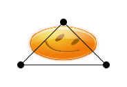
text-background-mode: The text background is a color painted under the text to make it more visible.none(default): No background is painted.plain: A rectangle of the size of the label is painted under the text, according totext-background-color. Under are the example of two graphs, one with no text background, one with a plain white text background:
-
rounded-box: A rounded rectangle of the size of the label is painted under the text, according totext-background-color. Under are the examples of two graphs, one with a plain text background, and one with a rounded box text background:
-
text-visibility-mode: The text visibility mode describe when the optional label of elements should be printed:normal(default): The label is always printed (according totext-mode).hidden: The label is never printed.at-zoom: The label is printed only if the zoom equals the first value oftext-visibility.under-zoom: The label is printed only if the zoom value is less than the first value oftext-visibility.over-zoom: The label is printed only if the zoom value is larger than the first value oftext-visibility.zoom-range: The label is printed only if the zoom value is comprised between the two first values oftext-visibility.zooms: The label is printed only if the zoom value is one of the values oftext-visibility.
-
text-visibility: The zoom values at which the labels should be shown, according totext-visibility-mode. -
text-color: The foreground color of the optional label. The default is black. -
text-background-color: The background color of the optional label. The text background must be specified bytext-background-mode. The default is white. -
text-style: The style of text to use.normal(default): The base font.italic: The italic version of the font.bold: The bold version of the font.bold-italic: The bold and italic version of the font.
-
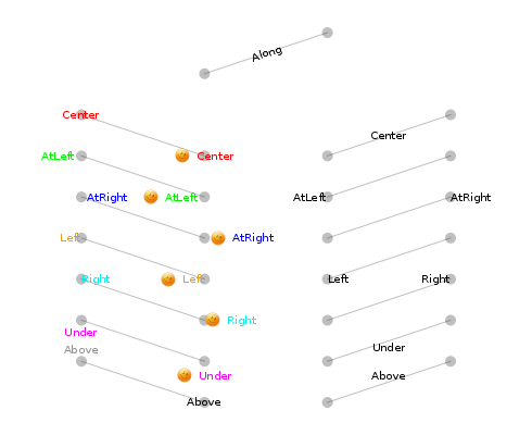
text-alignment: The alignment of the text with respect to the element center (node, sprite or edge).center(default): The text will be centered on the element center.left: The text will be aligned on the left of the element center.right: The text will be aligned on the right or the element center.at-left: The text will be aside the element at left.at-right: The text will be aside the element at right.under: The text will be under the element.above: The text will be above the element.along: This is useful only for edges, the text will centered on the edge and will have the same orientation as the edge.
-
text-padding: This adds some space between the text and the background borders, it is therefore used only when thetext-background-modedefines a background around the text. This can be one or two values defining the padding along the X and Y axis. If there is only one value, the value is the same on X and Y. The value for X are added at left and right (thus twice), and identically, the value for Y are added at the top and bottom. The default is 0.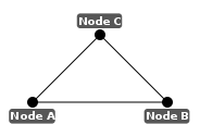
-
text-offset: This offset the text along the X and Y axis. If there is an icon, the icon is also offset. This can contain one or two values. If there is only one value, it is used both for the X and Y axis. The default is 0 for both axis.
-
text-font: The font to use for the text. The default is the default sans-serif font of your system. -
text-size: Size of the font in points only (number without units). The default is 10 points. -
icon-mode:none(default):at-left: The icon will appear at the left of the label. The icon URL is taken from theiconproperty.- There are no other alignment actually, although they are planed.
([Icon Mode](/media/css/icon1.css))
-
icon: This contains either the URL of an icon or the stringdyn-icon. In the later case, you can use theui.iconattribute on elements to specify the icon to use. For static icons using CSS is encouraged. However if you must vary often the icon of an element,ui.iconcan be useful.-
: The URL of the icon to use, either on the local file system or from the web. You can use the `url('')` notation. dyn-icon: The icon URL will be specified by theui.iconattribute stored on the element.
-
-
visibility-mode: Visibility of the element. The zooms values allows to show the element only at specified zoom levels.normal(default): The element is always visible.hidden: The element is not visible.at-zoom: The element is only visible when at the zoom level specified byvisibility.under-zoom: The element is only visible when at a zoom level less thanvisibility.over-zoom: The element is only visible when at a zoom level greater thanvisibility.zoom-range: The element is only visible when the zoom level is between the two first values ofvisibility.zooms: The element is only visible when the zoom level is exactly one of the values invisibility.
-
visibility: The values for the “zoom” modes of the “visibility-mode” property. -
size-mode: The size mode indicate how to set the size of the element.normal(default): The size is taken from thesizeproperty.dyn-size: The size is taken from thesizeproperty, excepted if aui.sizeattribute is stored on the element, in which case it must contain one or more numeric values giving the size of the element. These values are interpreted as pixels. However you can also store inui.sizestrings containing both the numeric value and one of the following units appended to the value:px,guand%.-
fit: The size of the element tries to fit its label. In this case thesizeproperty is ignored unless the element has no label. Under are two examples of graphs where nodes have thesize-mode: fit;property, and labels:
-
size: The size of the element, this contains one to three values for the X, Y and Z axis. If there are no value for Y, the X one is used, the same for Z. This size is used by thesize-modeproperty.
([Size](/media/css/size1.css))
Styling nodes and sprites
-
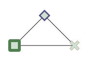
shape: Define the shape of the node or sprite. Theshapeproperty is usable for nodes, edges, and sprites, but the available shapes are not the same.-
circle(default): The node or sprite is drawn as a single circle or oval (depending on thesizeproperty).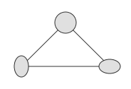
-
box: The node or sprite is drawn as rectangle, whose dimensions are given by thesizeproperty.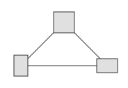
-
rounded-box: The node or sprite is drawn as a rectangle, like forboxbut with round corners. The radius of the round corners is not actually changeable.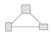
-
diamond: The node or sprite is drawn as a rhombus.
-
cross: The node or sprite is drawn as a cross.
-
pie-chart: Draw the node or sprite as a circle whose fill will be drawn as a pie chart. The values allowing to give each pie a size are given by an attributeui.pie-valuesstored on the element. This must be a set of values between 0 and 1 whose sum must not be larger than 1 (it can be less, in which case a part of the pie-chart will be left blank). The colors of the pies are given by thefill-colorvalues.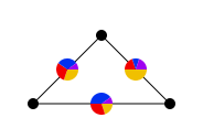
-
Styling for nodes
shape:-
freeplane: The node is drawn as a line whose length is given by the length of its label. This shape is specifically made to mimic the appearance of nodes in the mindmapping toolFreePlane. It must be used in conjunction with the same shape for edges. With this shape the you must usesize-modewith valuefitin order to make the node the length of the label. Furthermore notice that the FreePlane shape is drawn using the stroke, therefore thestroke-modemust beplain, usually the fill color is transparent, excepted if you intend to make the shape appear as selected.
-
Styling edges
-
shape: Define the shape of the edge. Theshapeproperty is usable for nodes, edges, and sprites, but the available shapes are not the same.line(default): The edge is drawn as a straight line of arbitrary width (depending on thesizeproperty, with default to 1 pixel).-
angle: The edge is drawn as a triangle whose base is on the source node of the edge, and that, like an arrow, points at the target node of the edge. The length of the base is given by thesizeattribute. The edge must be directed, else theangleshape acts as thelineshape.
-
cubic-curve: The edge is drawn as a cubic curve which always leave a node along axes X or Y.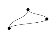
-
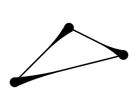
blob: The edge is drawn as an elastic blob between the two nodes. If the edge is directed, the blob sticks only at one end. The base of the blob is computed according to the node it is connected to. Thesizeproperty defines the width of the blob at its center. Under are two graphs, one undirected, the other directed: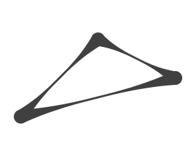
freeplane: The edge is drawn as a cubic curve, but connects properly to nodes having the shapefreeplane. This shape is specifically made to mimic the appearance of connections in the mindmapping toolFreePlane. See the description for node properties.
-
arrow-shape: The shape of arrows on directed edges. It is not possible to add an arrow to a non directed edge.none: Never display an arrow.-
arrow(default): Display a simple arrow whose dimensions are given by thearrow-sizeproperty.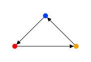
-
circle: Draw a circle or oval instead of an arrow.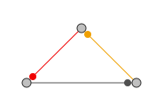
-
diamond: Draw a rhombus instead of an arrow.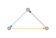
-
image: Draw an image whose URL is given by thearrow-imageproperty.
arrow-image:-
: The URL of the file on the local file system or of an image on the web to use for the arrow, if ``arrow-shape`` equals to ``ìmage``. dynamic: If the URL is the keyworddynamic, the image URL of the arrow is taken from the attributeui.arrow-image.
-
arrow-size: The size of the arrow, the first number gives the length of the arrow, the second expresses the base length of the arrow.
Styling sprites
-
shape: The sprite shapes can be all of the shapes already described for nodes, plus some specific shapes. Some of these specific shapes likefloware applicable only to sprites attached to an edge.-
flow: This shape works only if the sprite is attached to an edge. Draw the sprite as a line along an edge. The line start at the source or target node of the edge depending on thesprite-orientationproperty and runs to the sprite position on the edge.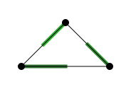
-
arrow: This shape draw the sprite as an arrow (and therefore, when attached to an edge allows to put several arrows on an edge). The arrow points toward a given point, specified usingsprite-orientation.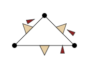
-
-
sprite-orientation:none(default): Most sprites do not need an orientation.fromornode0: If attached to an edge or node, the sprite points toward the source node of the edge or the node it is attached to.toornode1: If attached to an edge, the sprite points toward the target node.projection: If attached to an edge, the sprite points at its “projection” on the edge. This means that if the sprite is along the edge, but its second coordinates puts it far from the edge, it will point at a position on the edge.
Experimental style properties
The style properties listed in this section are still under development, and their behavior may change with the next releases of GraphStream.
-
shape-points: The shape points define a set of 3D points that one can use to define a new shape for elements. Actually, this works only for edges. See theshapeproperty for edges. -
shape: Here are some shape values that are in the works.jcomponent: For nodes and sprites, this allow to replace the node or sprite by a button, a text entry or aJPanel. The choice of which GUI element is given by thejcomponentproperty.polyline: For edges, this TODO
-
jcomponent:button: AJButtonreplaces the node or sprite shape. The state of the button is stored in attributes. TODOtext-field: AJTextFieldreplaces the node or sprite shape. The sate of the text field is stored in attributes. TODO- ??
panel: Not yet available. - ??
slider: Not yet available.